Hues That Say You
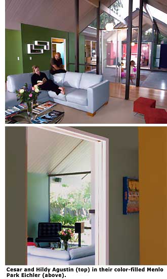
When Cesar and Hildy Agustin moved into their 2,600-square-foot Eichler in Menlo Park last year, the couple knew they were in for a battle of the sexes.
"I like modern, clean lines with bold colors -- and my wife likes soft lines and soft hues," Cesar says. "We love the California concept of blending indoors and outdoors together, and we wanted the wall colors to reflect that aesthetic. We also wanted to give the appropriate nod to the mid-century modern past."
Smartly, the couple called in backup in the form of professional colorist Carla Mathis. Unlike some done-in-a-day makeover pros, Mathis doesn't rely on a person or a home's exterior to dictate what colors look best in the space.
Instead, she asks questions to determine what motivates and inspires her clients. "The environment and color in a home must reflect the personality, hopes, and dreams of the people who live there," she explains.
For many, it can be a challenge figuring out how to work with color in airy, modern spaces. The groundbreaking post-and-beam architecture of MCM structures puts a focus on windows and walls. Plus, the open floor plans force homeowners to think in terms of complete home palettes that complement both the exterior and interior -- a daunting task for any novice decorator.
When homeowners think 'color,' they often think of the bright hues of the mid-century time period. With clear, cheerful colors, the 1950s exhibited a new American outlook of optimism that was comfortably removed from the drab war years. The decade's exuberance showed up on the walls in striking shades, such as turquoise and flamingo, and abstract shapes in furnishings and accessories. The 1960s took color much further, as acid green, blueberry, citron, hot pink, and day-glo orange took center stage.
"The colors in the mid-century were a reaction that went against what was there before," says Brooke Schneider, owner of Source, Inc., a Long Beach-based design firm. "What was there before were very somber, subtler, quieter colors. Colors in the '50s and '60s became brighter and stronger -- anti-establishment, but optimistic.
Colors were mixed in ways they hadn't been put together before, such as red and blue, and red and green. "In my home there were vinyl tiles in black, turquoise, and red before I tore them out," Schneider says. "They were a clear example of all the rules being thrown out the window."
The low-profile Eichler homes, built between 1950 and 1974, used nature as a major color cue; the unassuming designs were built to blend into the natural landscape. Many homeowners jazzed up interiors with fun furnishings and playful accents.

"Because these homes have a lot of glass, post-and-beam construction, and concrete floors, natural colors and materials are a good starting point to make them feel homey," says architect John Klopf of Klopf Architecture in San Francisco. "Homes can be perceived as cold if there is not enough natural texture and colors."
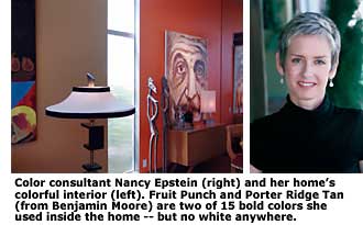
For those who want more color, there are several different approaches to choosing an interior palette. "Many people in mid-century homes don't put a lot of color on the walls -- and I think they can, and they should," says Nancy Epstein of Perfect Wall Color, a certified color consultant who lives in her own mid-century modern home, by architect Stan Goldin, in Long Beach.
Although white walls work well for many magazine-worthy modern interiors that are heralded for their simplicity, white doesn't always inspire a family that has to live there. Mid-century modern design, most experts agree, works best with earthier elements mixed with pops of color.
Function was as important -- and some say more important -- in mid-century designs, and the emphasis was placed on satisfying the needs of the average American family. While in the '50s that meant husbands who worked and housewives who stayed at home with the kids, today's families are much more active, and their home serves more as a refuge away from the bustle of work and as 'home base' for family and extracurricular activities. Families, for this reason, should consider decorating with color that exemplifies their lifestyle, Epstein points out.
