
Modern Address House Numbers
The style of the mid-century modern home puts special demands on homeowners in their selection of color, fabric, and material in ways that are different than furnishing and renovation challenges faced by owners of more-conventional homes.
The roots of these demands were stirred up in the era that followed World War II, when proponents of the evolving modern style actively embraced unadorned functionality and took advantage of newly developed manufacturing processes.
Modern furniture design was a prime example. Modern chairs, such as the ultra-modern Nelson Coconut, were completely based on new processes and materials that had more in common with a B-29 cockpit than a wingback chair. As sheet metal and cast aluminum rose in popularity, they also looked at home in the modern living room.
With a new palate of material and techniques, designers found themselves unencumbered by the need for ornamentation and adornment. Designs were condensed to their functional essence. Mouldings and trim fell by the wayside as tools and techniques were improved.
With this background in mind, shouldn't the house numbers that are mounted to the front exterior of your home reflect the same aesthetic as your home and furnishings? And how do you make your house numbers look like they're rooted in the mid-century?
First and foremost, your house numbers need to serve their primary purpose. We still need to get the pizza delivered, and the mail has to get home safely. Beyond that, consider making a simple statement: unpretentious and crisp, with no adornment. For this, look to a sans-serif typeface.
Serifs are the little 'enhancements' or extensions that are oftentimes added to the ends of letters. Their presence adds a distinction that makes letter faces easier to read.
However, minimalism, which is the soul of mid-century modern design, eschews adornments such as these. Fonts without serifs enhanced their own legibility by adding and removing weight.
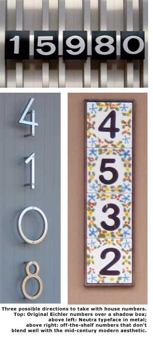
Popular sans-serif typefaces used today include Helvetica, Arial, and Futura. The differences between them are subtle but striking, and most seem to get the job done without tiring the eyes. At the midpoint of the last century, the go-to sans-serif font was Aksidenze Grotesque. This font, which was developed back in the 1890s, became Eichler Homes' choice for its original house numbers.
The materials of house numbers reflect a wide variety of possibilities. One popular house-number material that works well with modern homes is metal. New cutting techniques, using waterjets and lasers, have made metal letters more economical and widely available. Metal numbers also offer great durability—from the effects of sun and rain as well as from smacks by errant newspapers and basketballs.
Metal house numbers are optimized when they are mounted in such a way that they appear to be floating over the house's siding. This effect also causes metal numbers to cast a shadow on the siding background, adding to their three-dimensional look. Most of the cast or heavy-gauge metal numbers have posts on their backside that allow for easy mounting.
Neutra, a very popular typeface from the 1930s, was specified by the famous mid-century architect Richard Neutra for his projects and is still favored, especially in metal, by many architects of new contemporary homes. There are many other sans-serif fonts currently available, and some have scalable sizes.
When it comes to choosing a house-number font size for your home exterior, it can be problematic to select numbers that are too big as well as too small. When the number is the first thing you see when you walk by a home, it is likely too big. If the number is too small, or blocked from view at the street, be prepared for cold pizza—and generally being overlooked.
White cast-plaster lettering became popular in the 1950s. Plaster lettering mounted in a black-velvet shadowbox and displayed in lobbies of high-rise buildings of the era commonly highlighted the floor and office number of countless attorneys, dentists, and doctors. Having one's name in cast-plaster letters also meant that you had arrived.
Cast-plaster letters have a wonderful look—crisp, but slightly puffy—and their latex molds yield well to the medium. Being three-dimensional, plaster letters offer different views from different angles. They also beckon to be touched.
This raised lettering against a flat black background tile produced a contrast that rivaled much larger numbers, but without the additional weight and distraction that the large sizes brought. These reasons also may explain why Eichler chose plaster lettering to 'brand' his homes over the decades.
The downside of cast plaster is that while it performed well indoors, it usually did not stand up to the weather outdoors. There are still some original cast-plaster letters out there, even on Eichlers 50-plus years old, but by and large they are mounted on houses with protected overhangs. It is for this reason that Eichlernumbers.com introduced replicas of the original Eichler house numbers in weather-resistant, solid-surface Corian.