
Wall Art: The House Awakens - Page 2
While the concept of geometric, mathematical shapes often comes to mind when thinking about modern or abstract art, other approaches are also fulfilling. Russian artist Wassily Kandinsky is sometimes credited with being one of the earlier artists to paint an abstract picture, and yet, like Spanish surrealist Joan Miro, his images are at once complex, with curved lines a heavy dose of movement. Today, reproductions of some of Kandinsky's work can even be found in the IKEA catalogue. And Miro's work is forever imprinted on the minds of jazz fans and lovers of modernism for its appearance on the album covers of pianist Dave Brubeck ("Time Out"; "Time Further Out"). In fact, according to Brubeck, the music contained in "Time Further Out" was inspired by Miro's work.
Piet Mondrian and Mark Rothko are two other geometrically focused artists whose works are prized today for their simplicity in line, space, and color. Mondrian (Dutch, 1872-1944) is considered one of the pioneers of abstract art. He named his style Neoplasticism and described it as a style based on the absolute harmony of straight lines and pure colors. His most famous and characteristic works are known as the Transatlantic Paintings, which are unmistakable in their minimalist expression on white canvas—primary colors (blue, red, and yellow) and perpendicular lines. Rothko's work is geometric and understated, but in a different way than Mondrian's. For Rothko, it is about the simplest of all concepts: simple and understated rectangles of colors on canvas. One could do no better than Rothko, if you are thinking about using a grouping of smaller pieces from the same artist.
Different approaches to wall art would include modern-inspired weavings and tapestries, or even sculptures of metal, glass, or wood. "Weaving is a structure," says Kahn. "Strong contemporary weaving emphasizes the structure—and strong, contemporary architecture emphasizes the structure."
There are other objects that function well as art. For example, glass pieces made by the Murano factory in Italy are fabulous in Eichler homes, especially if they can be positioned next to a pane of frosted glass and affected by the light of dawn and dusk. A Murano can make a strong color and design statement. Still in production today, real Muranos may cost several hundred dollars, but some pieces—including copies—are quite affordable. Stores such as Crate and Barrel carry some lovely Murano-inspired glass pieces.
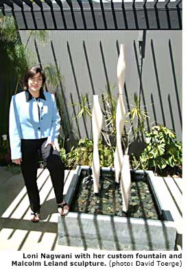
Architectural pottery is another art element that is harmonious with the Eichler design and provides a three-dimensional approach to art. Stark and often created in either pure black or white, with a matte finish, these pieces can be larger in scale than the typical vase or planter. As such, they work well on the floor in front of a fireplace, or in the entryway. Nagwani chose to display her Malcom Leland architectural pottery in a custom-built fountain located in her atrium. For choice examples of architectural pottery, see www.architecturalpottery.com
For some, the search for just the right art can be time consuming and complex, but it need not be. Some experts suggest that one begin by becoming familiar with the works of Bay Area artists from the 1950s and '60s. Two prominent books currently in print come highly recommended: "The San Francisco School of Abstract Expressionism" by Susan Landauer, and "Art in the SFO Bay Area, 1945-1980: An Illustrated History" by Thomas Albright. Whether or not your taste coincides with abstract art, the diversity of approach represented in these two books is quite dramatic. At a minimum, they can serve as guideposts, and better yet, inspiration for your own selection choices. Design magazines such as Dwell and Urban Living are other excellent sources for inspiration, especially since they routinely showcase entire rooms and houses dedicated to modernist design.
Another important consideration is color selection. Artist and Granada Hills Eichler owner Mary-Margaret Stratton suggests that if you are lucky enough to have your original Philippine mahogany paneling, begin with earth tones, which coordinate so beautifully with the wood. "If you put art on the wall that is harmonious with the paneling, you have a house that is linked," says Stratton. She also likes complementary colors. "I use a lot of oranges and rust. Some yellows. And I prefer warm undertones as opposed to cool undertones. I find that cool colors, such as ones with violet or burgundy undertones, are not as appropriate as the warm undertones." As Kahn puts it, "Color is a great source of expression that has been twisted and perverted into merely being decorative. I think that color speaks to content. And it matters as a fundamental component in expressive works."