key con remodeling  dura-foam solar center  nil erdal realtor
Eichler Network CA Modern
ca modernmagazine cover
To Get
CA-Modern
Magazine
Click Here
los angeles conservancy
pixel
HOME | ABOUT | CONTACT | ADVERTISE
abril roofing


transparent pixel
home improvement palettes and woman

HUES THAT SAY YOU
Colorful splashes, mid-century inspiration
that set the tone for your modern home

From the pages of CA-Modern magazine
By Tanja Kern

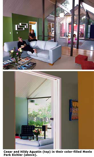
When Cesar and Hildy Agustin moved into their 2,600-square-foot Eichler in Menlo Park last year, the couple knew they were in for a battle of the sexes.

"I like modern, clean lines with bold colors -- and my wife likes soft lines and soft hues," Cesar says. "We love the California concept of blending indoors and outdoors together, and we wanted the wall colors to reflect that aesthetic. We also wanted to give the appropriate nod to the mid-century modern past."

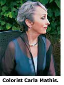
Smartly, the couple called in backup in the form of professional colorist Carla Mathis. Unlike some done-in-a-day makeover pros, Mathis doesn't rely on a person or a home's exterior to dictate what colors look best in the space.

Instead, she asks questions to determine what motivates and inspires her clients. "The environment and color in a home must reflect the personality, hopes, and dreams of the people who live there," she explains.

Cesar and Hildy Agustin color-filled Menlo Park Eichler

For many, it can be a challenge figuring out how to work with color in airy, modern spaces. The groundbreaking post-and-beam architecture of MCM structures puts a focus on windows and walls. Plus, the open floor plans force homeowners to think in terms of complete home palettes that complement both the exterior and interior -- a daunting task for any novice decorator.

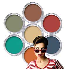
When homeowners think 'color,' they often think of the bright hues of the mid-century time period. With clear, cheerful colors, the 1950s exhibited a new American outlook of optimism that was comfortably removed from the drab war years. The decade's exuberance showed up on the walls in striking shades, such as turquoise and flamingo, and abstract shapes in furnishings and accessories. The 1960s took color much further, as acid green, blueberry, citron, hot pink, and day-glo orange took center stage.

"The colors in the mid-century were a reaction that went against what was there before," says Brooke Schneider, owner of Source, Inc., a Long Beach-based design firm. "What was there before were very somber, subtler, quieter colors. Colors in the '50s and '60s became brighter and stronger -- anti-establishment, but optimistic.

Colors were mixed in ways they hadn't been put together before, such as red and blue, and red and green. "In my home there were vinyl tiles in black, turquoise, and red before I tore them out," Schneider says. "They were a clear example of all the rules being thrown out the window."

The low-profile Eichler homes, built between 1950 and 1974, used nature as a major color cue; the unassuming designs were built to blend into the natural landscape. Many homeowners jazzed up interiors with fun furnishings and playful accents.

colorist Mathis

"Because these homes have a lot of glass, post-and-beam construction, and concrete floors, natural colors and materials are a good starting point to make them feel homey," says architect John Klopf of Klopf Architecture in San Francisco. "Homes can be perceived as cold if there is not enough natural texture and colors."

For those who want more color, there are several different approaches to choosing an interior palette. "Many people in mid-century homes don't put a lot of color on the walls -- and I think they can, and they should," says Nancy Epstein of Perfect Wall Color, a certified color consultant who lives in her own mid-century modern home, by architect Stan Goldin, in Long Beach.

Although white walls work well for many magazine-worthy modern interiors that are heralded for their simplicity, white doesn't always inspire a family that has to live there. Mid-century modern design, most experts agree, works best with earthier elements mixed with pops of color.

Nancy Epstein and interior

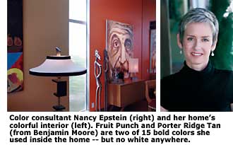
Function was as important -- and some say more important -- in mid-century designs, and the emphasis was placed on satisfying the needs of the average American family. While in the '50s that meant husbands who worked and housewives who stayed at home with the kids, today's families are much more active, and their home serves more as a refuge away from the bustle of work and as 'home base' for family and extracurricular activities. Families, for this reason, should consider decorating with color that exemplifies their lifestyle, Epstein points out.

If a house is completely remodeled, the designer and homeowners have the advantage of coming together and dreaming up palettes based on colors they love. However, most owners of mid-century modern homes, especially ones that have historical value, don't have either the inclination or the luxury to start from scratch. With that in mind, it becomes important to use all the existing elements in the home as a starting point.

"When I do a color consult, I do a quick tour of a home, take in a feeling for the family's style and tastes, and look for cues from stone, floors, brick, cabinetry, wood, and countertop materials," says Epstein. "Those things, usually, aren't going to change."

lou palladino exteror and door

Cork floors, brick and stone fireplaces, and architectural features are great jumping-off points. Sometimes these items already blend into a pleasing color palette, but sometimes they don't. That's where paint colors come in. "We can use wall colors to connect materials and spaces together so that that work well together," Epstein says.

The key to choosing a pleasing palette is to consider each room as a part of the whole. "Every color should flow with the other colors, even if they are not placed together," Epstein says.

When working with her clients, Epstein takes a brief house tour and often develops the entire palette while sitting in one room. This encourages the homeowner to think about colors that work well together -- a mix of dark, light, cool, and warm. After the palette is established, colorist and her client walk through the home and choose where to place each color.

The Agustins, who are parents to two young children, Isabel and Diego, determined their color palette in a few savvy steps. First, the couple collected photographs of furnishings, colors, and art they liked by perusing design magazines, books, and websites.

The Agustins then separated out three sets of photos: one for him, one for her, and a group they both liked. Their color consultant, Carla Mathis, together with her prot é g é , Craig Lauchner, helped the couple come to a compromise. As a rule, the Agustins chose wall colors that would look good used on the same wall that stretched indoors to out.

In the living room, for example, Mathis recommended two shades of green -- one selected by Hildy and one by Cesar -- that worked well together. The pair then picked colors for the rooms in which each spent the most time: soft blue for Hildy in the bedroom, dark chocolate in the media room for Caesar. In the office, Carla custom-blended a wall color that matches Cesar's skin tone. The guest room was decked out in a bold red that both couples could live with.

The home's completed look incorporated 11 different paint hues. Cesar says it's not an easy thing to create this much color in one house, especially when you're trying to combine two very different design preferences, but the end result, he says, was well worth the negotiations.

6 exterior views

"Even my in-laws, who prefer more classic designs, said that although they would not choose a single color on our walls for themselves, they find the house quite welcoming and comfortable," he says.

At times, homeowners are so taken by the historical significance of their spaces, they prefer not to update their choices, and opt instead to stick with the original color palettes.

"But sometimes," according to Schneider, "this looks very clich é d and not very surprising. It's much more interesting to use different palettes and spice them up somehow. I often do colors that are sort of adapted shades of what would have been lime green, bright blue, and orange, but muted versions of those colors."

The windows in MCM homes play a big role in the color-selection process. Hues on walls, floors, and fixtures will change from morning to night, so it's imperative that homeowners use large swatches and see how colors change throughout the day.

For those who are hesitant to bring out the paint brush, a good way to warm up to the idea is by selecting one base house color, such as white, beige, or gray, and paint accent walls and architectural details with pops of color.

"People get weird about paint, like it's a commitment. But it's one of the cheapest things you can change," Schneider says. For example, architect John Klopf sometimes paints the inset of skylights a sunny yellow to help give a room a warm glow. Today, colors such as burnt orange, coffee brown, and fern green are popular choices that fit into the mid-century home color palette.

While paint can make a huge difference in a home's interior, cleverly chosen surfaces and fixtures can also make a big impact. Klopf says homeowners could choose one showy material, such as a brighter countertop color or color-stained concrete floor, and then allow the other colors to blend into the background.

A favorite in Eichler homes with radiant-heated floors, concrete floor staining and topcoats have become more popular as homeowners look to transform plain or damaged concrete floors into unique and colorful works of art.

According to Brian Vicari, who produces cutting-edge concrete designs as the Concrete Colorist, these treated flooring applications can blend seamlessly from indoors to out and actually "take on just about any color, pattern, or texture." Some homeowners look to their floors as a starting place for laying down thematic interior color, points out Jay Anderson, president of Newlook Coatings and Stains in San Jose, "asking us to do variations on color, or multiple colors, on the same job."

Some of today's chicest and most colorful surface options are often the most earth friendly. In 2002, EnviroGlas, of Plano, Texas, started fabricating flooring and countertops made of old glass bottles, mirrors, and windows. With a wide variety of glass and porcelain options and a fully customizable binder (bonding together the pieces of glass or porcelain to form a slab), the color possibilities are endless.

Vetrazzo, located in Berkeley, also offers recycled glass countertops made of 85 percent recycled glass. Colors range from crisp white and arctic blue to amber or firehouse red. Specializing in custom kitchen countertops of the concrete variety, It's Concrete!, based in the East Bay, produces a wide array of color options and inlays that can also provide a burst of color accent.

For those who want to introduce a bold-colored fixture in a room, consider neutrals for the other elements of the space. Using the same stained-wood species in cabinetry installed throughout a home can help unify spaces. Instead of choosing a stainless steel refrigerator, which can bring with it a cool look, Klopf recommends covering large appliances with wood cabinetry that show off the natural grain.

designer brooke schneider

While floors and countertops may be costly to change out, accents such as backsplashes and wall colors are less of an investment.

"People are afraid of color, but if you can talk them through using colors in a limited way, they can have fun and not be scared," Schneider says. "I always recommend that people go neutral with things like flooring and countertops."

The right color palette can help make an inviting impression on a home's exterior, too. Eichler Homes used stains by Cabot Stains, not paint, on their original homes, inside and out. Stain helped to keep the grooves of exterior siding crisp and the silhouette sleek. Over the years, most homeowners covered faded stain with paint.

"Although we're mostly doing coatings with paint nowadays, I encourage Eichler owners to stick with the traditional style of the colors -- deeper earth tones for the body and trim, medium tones for the eaves, and whites or off-whites for the beams and fascia," recommends Lou Palladino, owner of Palladino Painting, based on the San Francisco peninsula.

The Lucas Valley Homeowners Association, made up of nearly 550 Eichler homes in San Rafael, takes great strides to maintain the original personalities of their mid-century homes and the mood of the neighborhood. Strict architectural guidelines, which include paint specifications, help to preserve the community's character. In fact, just about anything that can be viewed from the street must first be approved by the association's Architectural Review Committee.

In Lucas Valley, almost every house is viewed against a backdrop of classic Marin County rolling hills. A house that is too light or too bright will "stand out obtrusively and clash with this otherwise tranquil scene," says Janice Cunningham, the LVHA's business manager. "Most homeowners are understanding of the need to have these guidelines and are happy to follow them."

concrete flooring new look coatings

The association's guidelines are consistent with the design principles followed by Eichler's architects. The LVHA's exterior paint color palette for Eichlers, which is represented by more than 60 colors, is specified as muted earth tones, such as variations of brown, tan, rust, green, and gray. Bright colors are used sparingly, as accents on doors or other key building features. Siding, garage doors, posts, window frames, and doorframes are the same color as the body color. Beams are white, deep brown, or natural wood. Horizontal fascia boards are lighter or darker to complement the body color.

Lou Palladino notes that the narrow foundation at the base of Eichler homes, which is usually painted the same color as a home's siding, can look sharp when painted a dark charcoal gray or black. "If that lower edge is visible, this technique can give the house definition," he says.

recycled glass countertop, from Vetrazzo

No matter what the choices, experts agree that homeowners shouldn't look at color choices in a vacuum. "When people come through the door of their home, there should be this sense of delight," Mathis says. They should be influenced by history, lifestyle, and a homeowner's personal taste and color preferences.

"There are so many correct choices," colorist Nancy Epstein says. "There's not a right choice. We are finding the right one for you."


Photos: David Toerge, John Eng, Matt Fukushima, Robert Wagner, Joel Puliatti; and courtesy Perfect Wall Color, Vetrazzo, Body Beautiful, Newlook Coatings

Special thanks to Lou Palladino of Palladino Painting, Inc., Dave Salas of California Paints (Sunnyvale), Janice Cunningham of the Lucas Valley Homeowners Association, and Catherine Munson for their assistance in compiling our chart of original Eichler paint colors


RESOURCES

Nancy Epstein: perfectwallcolor.com
Brooke Schneider: source-rd.com
Carla Mathis: bodybeautifulonline.com
John Klopf: klopfarchitecture.com
Palladino Painting, Inc.: palladinopainting.com
Paul Benson Painting: paulbensonpainting.com
California Paints: californiapaints.com
EnviroGlas: enviroglasproducts.com
It's Concrete!: itsconcrete.com
Vetrazzo: vetrazzo.com
The Concrete Colorist: theconcretecolorist.com
Newlook Coatings and Stains: newlooksystems.com

When it's time for your next home-improvement project, consider the Eichler Network's team of 'Preferred Service Companies.'


Paint vs. stain:
inside and out

Wood plays a significant role in Eichler homes, which rely on wood exterior siding and Philippine (AKA lauan) mahogany interior paneling for much of their original character. Homeowners and contractors still carry on great debates over painting versus staining these two surfaces, and about preserving versus removing (and replacing with sheetrock) the interior panels.

But the proper approach for addressing the two surfaces really depends on a homeowner's individual aesthetic, the condition of the wood, and how much money and maintenance homeowners are willing to throw at them.

Eichler took great care in the overall appearance of his homes and created custom wood siding for his home exteriors instead of using the standard plywood patterns of the day. To accentuate the natural beauty of the wood grain, he used stain. Of course, stain usually didn't stand up to time and natural elements, and homeowners were forced to re-stain or paint, oftentimes sooner than expected.

"If you're staining, a job could last anywhere from four to six years, depending on how the sun hits the building," says Lou Palladino of Palladino Painting. "Both transparent and solid stain coatings are more delicate and less durable than paint coatings. However, in the interest of preserving the original Eichler aesthetic, some may prefer going with stain over paint."

While painted siding can be brought back to bare wood and then stained, typically the process is not cost effective. In such cases, homeowners who want the benefits of original stained siding usually explore replacing their siding as the first step in the process.

Stains are manufactured as solids, which cover up the wood like paint; semi-solids, which provide opaque color that conceals the wood grain but still show off some of the texture; and semi-transparent stains, which enhance the wood's texture without concealing the wood grain.

While Eichler originally used mostly Cabot semi-solid oil-based stains on his exteriors, today most painting professionals favor water-based acrylic paints over oil-based products for their longevity.

For home exteriors that are already painted, Palladino recommends re-painting the siding to better protect the home from the elements. "I've had paint jobs that lasted 15 years," he says. "Professional painters know a lot of 'tricks' to help a paint job last longer. But the real secret is in the preparation performed on the existing surfaces."

interior with white beams

Palladino recommends applying paint with a sprayer, and then back rolling, instead of painting by hand. "Spraying puts on nearly twice as much paint as a brush or a roller, and makes the application last longer," he explains. In addition, for color retention and moisture resistance, he prefers satin sheen paint rather than flat paint, which is more porous and soils more easily.

Interior paneling is yet another challenge in Eichler homes. With the passage of years, the lustrous lauan often becomes worn, stained, and discolored, and tends to darken with age.

"If a homeowner had a picture hanging on the wall for several years, the area behind the picture is always darker than the areas around it," says Paul Benson of Paul Benson Paining of San Rafael.

Blending in a stain color into the lighter wood and applying a coat of polyurethane can often repair this type of discoloration. Stripping the paneling, re-staining, and coating with a protective topcoat can oftentimes bring the panels back to their original glory.

While the original Cabot stain wax product that Eichler used was discontinued during the past decade, Eichler owners report using other products with success for re-staining projects, including Minwax, Watco Danish Finishing Wood Oil, as well as Cabot's opaque 2000 series stain. These products are usually combined with a wood cleaner and a finishing application, such as Touch of Oranges and Howard's Feed-N-Wax. Test strips are always recommended.

For those who are facing damaged paneling or simply want a lighter, brighter room, there are two options: replace the paneling and then stain or paint with a lighter tone, or paint over the existing paneling. For the latter, seams of the lauan panels can be taped and textured to actually simulate the appearance of sheetrock.

"There's value in maintaining the integrity of the Eichler home by keeping the wood natural, but the problem is that some of these rooms get really dark because they're not very well lit," Benson points out.

"A good 50 percent of Eichler owners I work with are interested in painting the paneling -- to brighten it and give it more appeal. The lighter color palettes can really transform an Eichler interior."


Original colors:
inspiration begins

Reconstructing the original Eichler color palette is not unlike conducting an archaeological dig. Much information has been lost over time. But we've been steadily putting it all back together.

Pictured below are close matches for several of the exterior body colors used by Eichler Homes that inspired and were part of the palette that comprised the 1950s-era Cabot Stains' Ranch House Hues catalogue. Cabot still has several original Eichler colors in production.

Eichler's original exterior accent colors were reportedly furnished by Dunn-Edwards, but all have been discontinued. Several close matches appear below.

For our examples, when possible and available, comparable color equivalents are represented as follows: for body colors, Cabot Ranch House Hues originals (RH) are translated into currently available Benjamin Moore (BM) colors; and for accents, Dunn-Edwards (DE) originals are translated into current Benjamin-Moore (BM) colors.

While we strived to closely match the original colors with our reproductions here, for more exact matches please refer to the manufacturers' in-store printed catalogues of color chips for the colors desired.

Codes: ^ indicates selection is currently available from Cabot under the original Ranch House Hues paint name. + indicates color selection is included in the Lucas Valley Homeowners Association recommended palette


Original Eichler Exterior Body Colors (partial list)

oak brown swatch adobe swatch ca redwood  swatch el capitan chip
coast guard chip red cedar chip alcazar swatch aspen chip
cordovan chip pipestone chip beige swatch charcoal chip
spruce blue chip tansu toasted marshmallow chip sandstone chip bark bittersweet chocolate  chip
pewter gray chip dark gray chip desert sand chip taupe  chip
driftwood gray chip

Original Eichler Exterior Accent Colors (partial list)

black forest chip eucalyptus chip storm chip turquoise chip
paprika chip pumpkin chip black bark chip seal brown chip
sunflower chip

Online color tools

Want a designer color palette without spending too much time, money, or energy on the endeavor? Here are some cool online tools to help make your job easier:

Photo inspiration. Do you have a photo or image that inspires your home decor? The Big Huge Labs 'Palette Generator' is a handy online Flickr tool that quickly creates a 'harmonious' color palette when you upload a photo to the website.

Color lovers. If you're a trend follower, colourlovers.com is the website for you. This site monitors color trends and provides a myriad of color palettes to consider.

Color conundrum. Learn how the colors you choose impact your mood and emotions. The website squidoo.com/colorexpert, written by recognized color expert Kate Smith, discusses the research and psychology behind various hot hues.


Splashes of color
for interior pizzazz

  1. Inspiration point. Don't want to commit to color in a big way? Use tile to create artistic splashes of color on backsplashes and accent walls. Modwalls' Brio glass tile blends are colorful, economical, and customizable for any space. Choose from 82 shades or create your own custom blend. Seen here: Brio Blends by modwalls (starting at $5.95 per square foot).
  2. Pillow talk. Add pizzazz to modern interiors with brightly colored accent pillows. They instantly dress up a neutral sofa or chair and can be changed out to reflect the mood of the season. Create a designer look by coordinating pillows of similar colors but different designs. Choose pillows in weather-resistant fabric, like Sunbrella, for outdoor spaces. Seen here: Blue and gray Pods pillow ($175), pink-and-white and black-and-white Mibo pillows ($108 each) from One Stop Modern.
  3. Art walk. Mid-century modern homeowners are purveyors of great taste, right? Show off your flair for art -- or your sense of humor -- by decking your walls in a few carefully chosen paintings or photographs. Seen here: 'Eat At Joe's' by TJ Rappel ($425) and 'Accelerator' by Bonnie de Arteaga ($750). remedywhite.com
kitchen interior and pillow


dura-foam solar center
eichler solutions

Top of Page


pixel

The Eichler Network
info@eichlernetwork.com