Type that Talks - Page 2
 |
 |
|
|
 |
 |
|
|
Coles, associate curator at San Francisco's Letterform Archive, an amazing repository of material about type throughout the ages, notes how sans serif type worked brilliantly in the trendsetting 'Think small' ad campaign for Volkswagen.
Sans serif types were popularized in the mid-century, first by designers in Switzerland, who produced the now-ubiquitous Helvetica—with its "clean, no-nonsense shapes," in the words of authors Gavin Ambrose and Paul Harris—and Univers, distinguished for its "cool elegance and radical competence."
The Swiss School descended from earlier European type designers, including some associated with the Bauhaus and the De Stijl movement from Holland.
By the 1950s, write Steven Heller and Louise Fili in their book, Typology: Type Design from the Victorian Era to the Digital Age, graphic artists influenced by these movements were creating geometric layouts and often limited themselves to using single typefaces, rather than mixing things up as the Victorians had done. The effect could be cool or even machine-like.
The thinking of these designers harked back to artist Theo van Doesburg in the 1920s "calling for a universal art of absolute clarity based on arithmetical standards."
"Helvetica was the type of choice," Heller and Fili write, "for it was meant to be universal, clean, and rational."
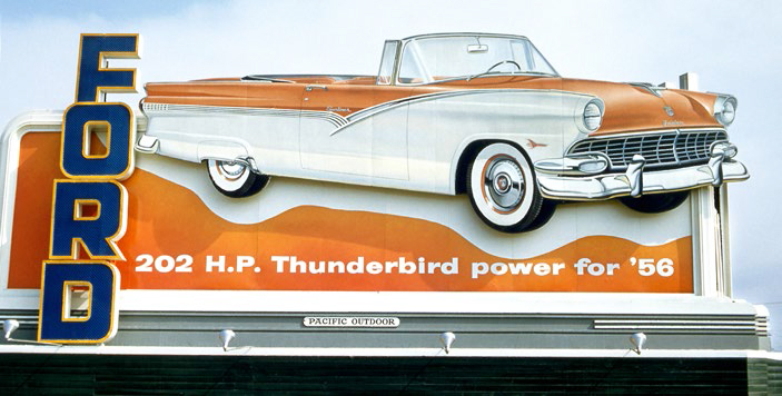
But Coles emphasizes too the warmer side of mid-century typefaces. "The strict, straight, and mechanical was tempered by a human touch and the imperfection of natural forms," he writes. "And despite the emphasis on functionalism, the movement also had a sense of humor and whimsy. This was reflected as much in mid-century typography as it was in furniture and architecture."
In describing the warmer typefaces, many with serif endings, Coles goes on to describe the school of design that fits many of California's mid-century architects, including those who worked for Eichler. These were architects closer to the rustic Bay Tradition of architecture than to the cooler International Style.
"When I think of the sculptural teak of a Juhl or Wegner armchair, or the fluidity of Saarinen's Tulip chair, or the organic curves of Eames' bent ply, I think of warmer stuff," Coles writes.
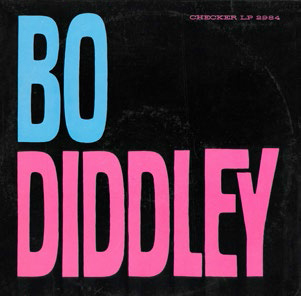
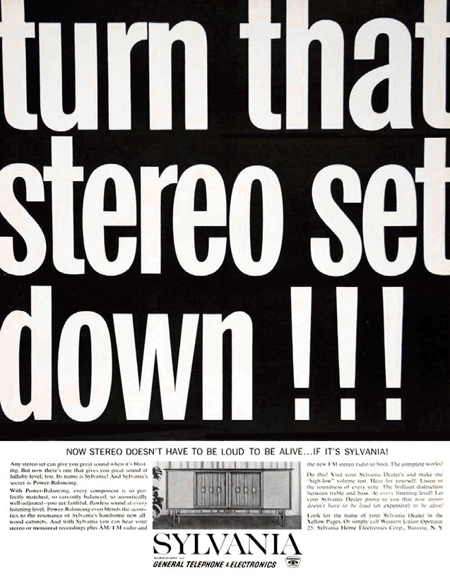
"I think of the rich sparkle generated by serif text type, like Caledonia and Century Expanded. I think of Ultra Bodoni, Craw Modern, Carousel, and Pistilli Roman—curvaceous sirens whose extreme stroke contrast (the difference between thick and thin strokes) and big ball terminals [decorative circular forms at the end of letters - Ed.] attracted viewers to advertising, logos, record covers, and magazines."
Curvaceous sirens! How typographers love their type!
Some serif typefaces proved popular among modern designers too, including Ultra Bodoni.
