
Type that Talks - Page 3
 |
|
|
 |
 |
 |
|
|
"You see a lot of really bold type, and not just sans serif," used in mid-century designs, Widdows says. "There were some really good serif typefaces, very heavy, like Ultra Bodoni, where the downstroke is very thick and the serif is very thin. That's called a highly contrasted letterform."
"Ultra Bodoni was rooted in tradition, but when used at very large sizes it felt new, bold, and beautiful."
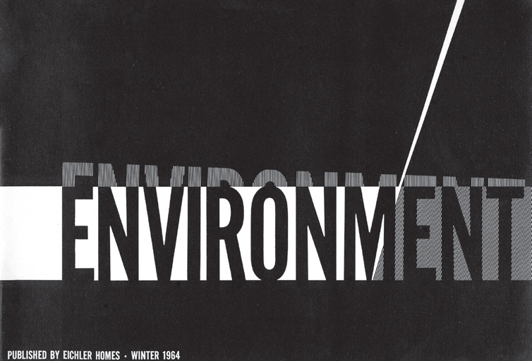
And throughout the mid-century, designers used custom type designs too, often of a florid or amusing nature, rather than off-the-shelf typefaces.
Eichler—or at least his graphic designers—used a varied collection of typefaces in an eclectic and often humorous fashion, in tract brochures and print advertising.
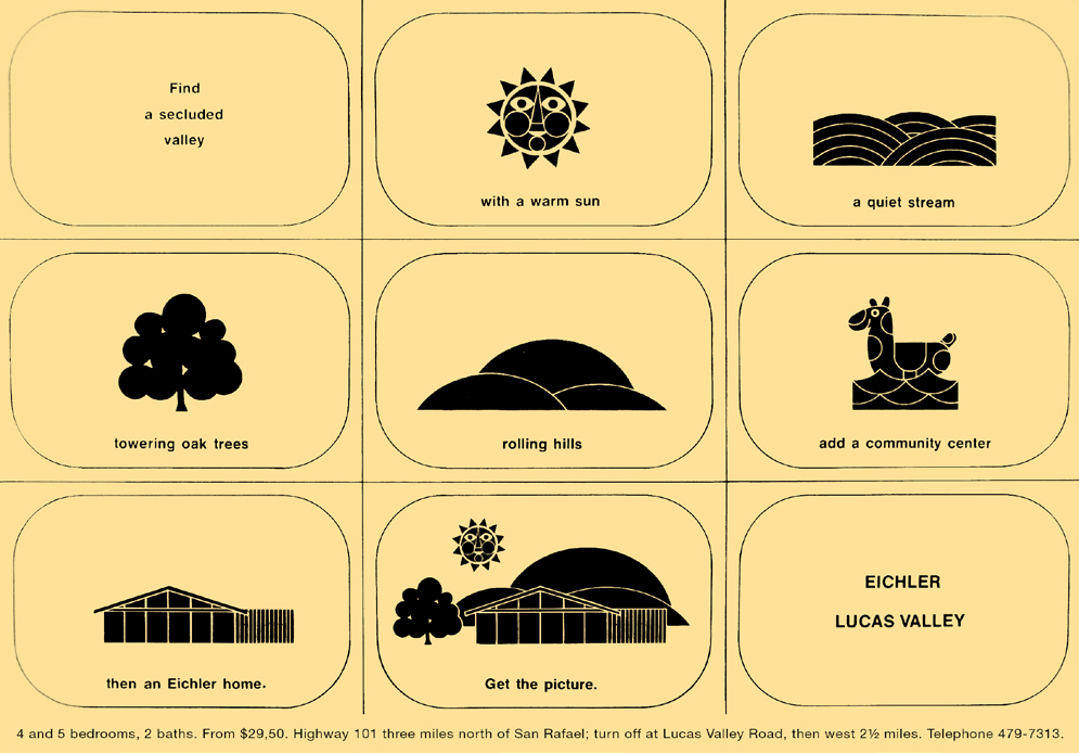
In one ad for his neighborhood in Marin's Lucas Valley, Eichler stuck to a self-effacing sans serif, letting child-like drawings dominate the design.
But for a brochure announcing an art exhibit in Eichler's Castro Valley tract, the word 'ANNOUNCING,' in tall sans serif letters that bled off the page, dominated the design, which was created by Eichler's frequent collaborator, artist Matt Kahn.
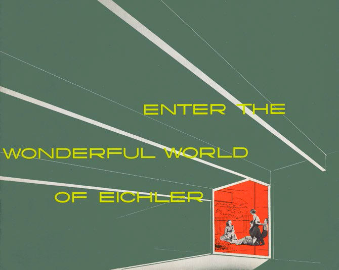
Then there's a brochure Eichler produced for several of his tracts around 1960, where the words 'Enter the Wonderful World of Eichler,' sans serif and all caps, stretch laterally like taffy, the 'Os' forming flattened saucers, to emphasize the length of the home's ceiling beams and its spacious living areas.
For one humorous campaign, Eichler's designer opted for a bold, all-caps serif typeface arranged in tiers, suggesting an advertising handbill handed out on street corners in Queen Victoria's London.
Before leaving Eichler's use of type, it's worth noting that the type used for most of his house numbers, Berthold Akzidenz Grotesk, better known in the United States as 'Standard,' was designed in 1898, but revived in the mid-20th century.
A brochure for Standard Berthold from 1950, in the collection of the Letterform Archive, brags about the typeface's "austere beauty," and says that it "originated in the last years of the 19th century, and its graceful unpretentious outlines do not attempt to repudiate that affinity in the slightest."
In the United States, the use of type in mid-century modern designs was more eclectic than in the work of the earlier European modern designers.
"Sans serifs were popular and Futura prevailed, but these were often complemented by Bodoni, Garamond, and Caslon Romans and italics; modernism's hard edges had been removed," Heller and Fili write.
The development of phototypesetting, supplanting the use of hot metal type, in the 1950s and 1960s "allowed more people to design typefaces," Widdows says. "Phototypesetting was a much less expensive process, so you see a lot of experimental designs from this period."
Shelley Gruendler says California developed its own variants of typography too, in part because of our automobile-inflected lifestyle.
Signs were designed to catch the eye of motorists speeding by, she says, adding, "The way people in California invented the billboard in Los Angeles." She cites "the sign painters and hand letterers" as being particularly influential.
"California was more open to new ways of thinking, and California had the money," Gruendler says, suggesting how type took on a California tinge. "The light is different in California."