

Don't Be Afraid of the Dark
 |
|
|
When choosing an exterior color palette to paint your mid-century modern home, it's easy to get caught up in social conventions that a color or shade take on. The challenge is to stay focused on your ultimate goal: find the particular palette that makes your home look best to you and to the world around you.
Virtually any color expert you consult about the topic these days will suggest dark shades for the exterior body of a modern home, offset by different hues for the front door, beams, and eaves. Interior designer and Sunnyvale Eichler owner Lucile Glessner even refers offhandedly of the need to "go on toward the dark side for the exterior."
Wait, the dark side? As in: Darth Vader, cinematic evil incarnate of the late 20th century?
Or maybe you have a more rational but visceral reaction to painting your house dark: It's not cheerful, and some might even call it downright depressing.
To be truly rational and end up with a palette you can live with, however, requires consideration of the very essence of an Eichler or similar mid-century modern home.
So don't be afraid of the dark.
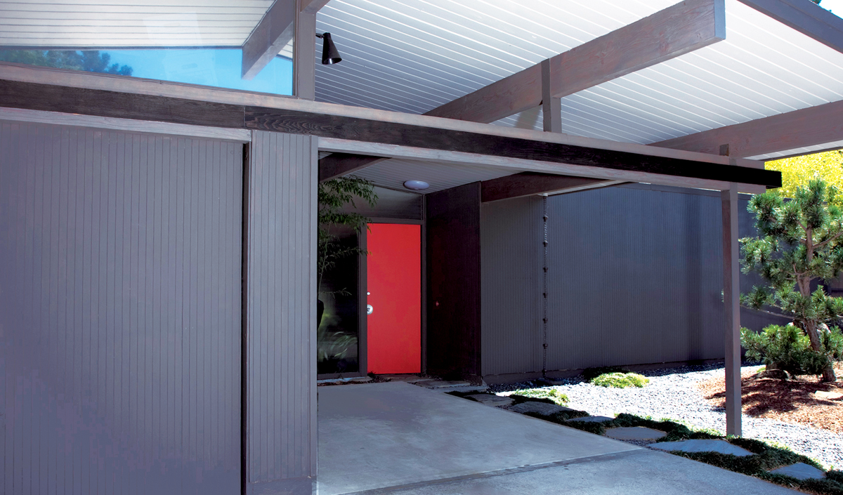
"The original Eichlers were [stained with body colors] dark in tones," notes Glessner, owner of Lucile Glessner Design. "That was the intent: to blend with the environment. It's also why they're one story."
 |
 |
|
|
"The Eichler was designed to blend into the earth," agrees Lou Palladino, owner of Palladino Painting, based in Half Moon Bay. "I try to encourage people to keep it simple with the body color."
It's no coincidence that the designer and painter agree on this subject, but they do cite some different explanations for their position, and one is slightly more appreciative of going to the lighter side.
"One of the things that's different about Eichlers, they don't have a uniform trim feature. They don't uniformly wrap something," noted Palladino, who has painted scores of the homes. "Some of them are hard to put to a trim color....With the irregular trim, they just hold color better when they're darker."
"When people want my opinion, I'm happy to give it," he said of his clients. "Some people are fine and have a very clear picture of what they want...I don't get that attached to the colors, because it's the homeowner who has to be happy with it."
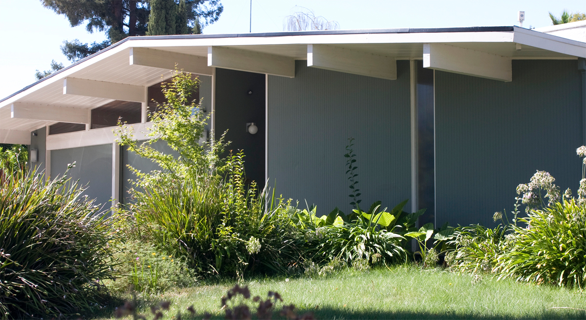
Similarly, if a client insists on painting a lighter body color, like cream—Glessner can recall many Eichlers being that color back when she bought hers in 1993—the designer responded, "I have to say, it's not bad either."
While always willing to defer to a customer, Palladino never recommends painting an Eichler cream, stating bluntly, "In my opinion, it's too light."
Search