

Primo Paint Colors for Eichlers
 |
|
|
Ever wonder what our world would be like if all Eichler homes were painted creamy white, inside and out?
What if Joe Eichler's design philosophy embraced such color homogeneity to achieve an enduring feeling of peace and serenity? "Besides," he could have added to our tall tale, "white reflects heat and will help my homeowners stay cool in the summertime."
Well…don't believe that one for a minute.
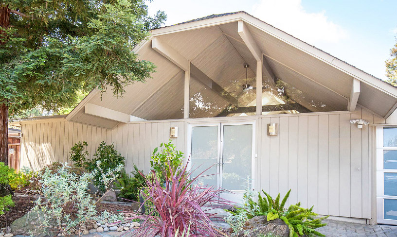
Instead, with some historical fact to back us up, let's take you down a different path…and consider why Joe instead chose earth-toned colors to express his feelings.
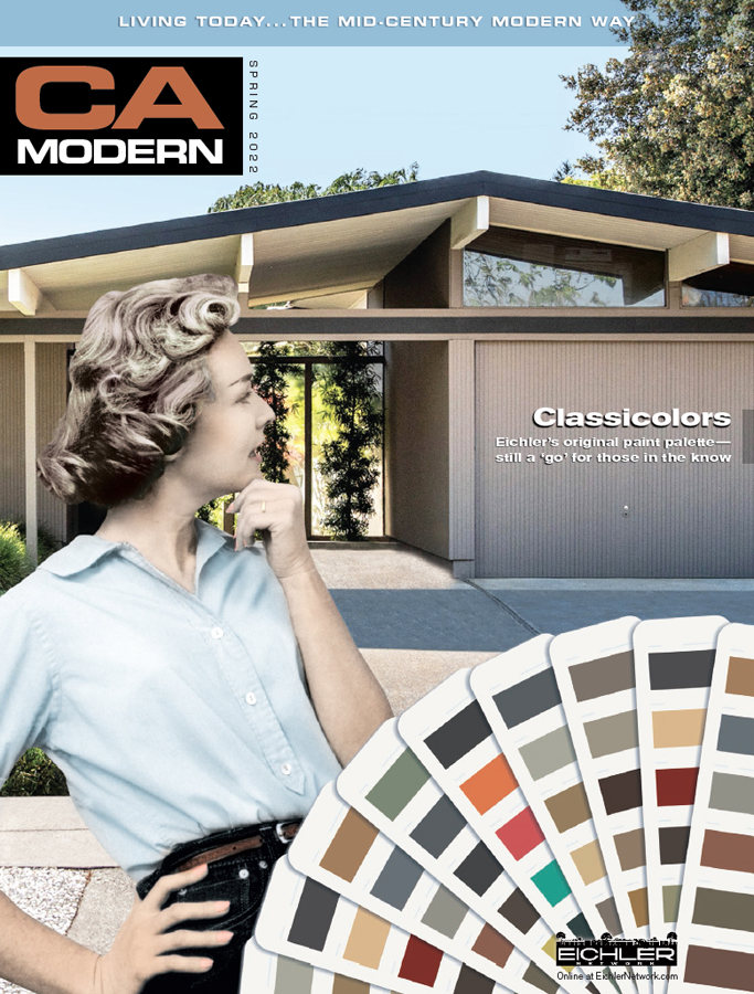 |
That's the ideology Eichler Network staffers embraced when they brought together 'House of Many Colors,' a home-improvement feature that doubles as cover story for the new spring '22 issue of our CA-Modern magazine.
There's a solid philosophy behind an earth-toned palette. White can lend a sense of being dull and unfinished, a mere base coat for colors to come. Whereas, a carefully selected color scheme built on earth tones can embrace the home with dynamic range and dimension while highlighting its architectural features.
In general, professional designers tend not to prefer all-white walls or select one-dimensional hues.
House Beautiful magazine calls the monochromatic look "a paint color mistake you should never make," and they're not alone with this belief.
 |
|
|
"Colors that have no depth are oddly fluorescent. They will leap out at you, rather than pull you in," says Suzanne Kasler, an award-winning designer quoted in the article. "It's a subtle difference, but failure to recognize it is sometimes why people are afraid to use color."
Search