

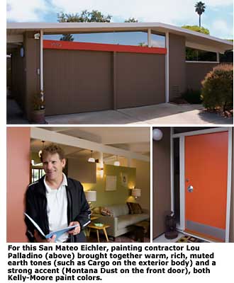
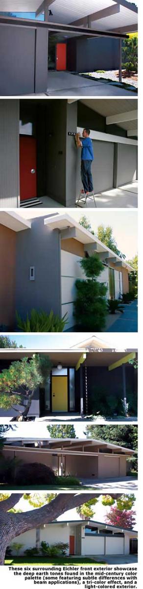
Hues That Say You - Page 2
If a house is completely remodeled, the designer and homeowners have the advantage of coming together and dreaming up palettes based on colors they love. However, most owners of mid-century modern homes, especially ones that have historical value, don't have either the inclination or the luxury to start from scratch. With that in mind, it becomes important to use all the existing elements in the home as a starting point.
"When I do a color consult, I do a quick tour of a home, take in a feeling for the family's style and tastes, and look for cues from stone, floors, brick, cabinetry, wood, and countertop materials," says Epstein. "Those things, usually, aren't going to change."
Cork floors, brick and stone fireplaces, and architectural features are great jumping-off points. Sometimes these items already blend into a pleasing color palette, but sometimes they don't. That's where paint colors come in. "We can use wall colors to connect materials and spaces together so that that work well together," Epstein says.
The key to choosing a pleasing palette is to consider each room as a part of the whole. "Every color should flow with the other colors, even if they are not placed together," Epstein says.
When working with her clients, Epstein takes a brief house tour and often develops the entire palette while sitting in one room. This encourages the homeowner to think about colors that work well together -- a mix of dark, light, cool, and warm. After the palette is established, colorist and her client walk through the home and choose where to place each color.
The Agustins, who are parents to two young children, Isabel and Diego, determined their color palette in a few savvy steps. First, the couple collected photographs of furnishings, colors, and art they liked by perusing design magazines, books, and websites.
The Agustins then separated out three sets of photos: one for him, one for her, and a group they both liked. Their color consultant, Carla Mathis, together with her prot é g é , Craig Lauchner, helped the couple come to a compromise. As a rule, the Agustins chose wall colors that would look good used on the same wall that stretched indoors to out.
In the living room, for example, Mathis recommended two shades of green -- one selected by Hildy and one by Cesar -- that worked well together. The pair then picked colors for the rooms in which each spent the most time: soft blue for Hildy in the bedroom, dark chocolate in the media room for Caesar. In the office, Carla custom-blended a wall color that matches Cesar's skin tone. The guest room was decked out in a bold red that both couples could live with.
The home's completed look incorporated 11 different paint hues. Cesar says it's not an easy thing to create this much color in one house, especially when you're trying to combine two very different design preferences, but the end result, he says, was well worth the negotiations.
"Even my in-laws, who prefer more classic designs, said that although they would not choose a single color on our walls for themselves, they find the house quite welcoming and comfortable," he says.
At times, homeowners are so taken by the historical significance of their spaces, they prefer not to update their choices, and opt instead to stick with the original color palettes.
"But sometimes," according to Schneider, "this looks very clich é d and not very surprising. It's much more interesting to use different palettes and spice them up somehow. I often do colors that are sort of adapted shades of what would have been lime green, bright blue, and orange, but muted versions of those colors."
The windows in MCM homes play a big role in the color-selection process. Hues on walls, floors, and fixtures will change from morning to night, so it's imperative that homeowners use large swatches and see how colors change throughout the day.
For those who are hesitant to bring out the paint brush, a good way to warm up to the idea is by selecting one base house color, such as white, beige, or gray, and paint accent walls and architectural details with pops of color.
"People get weird about paint, like it's a commitment. But it's one of the cheapest things you can change," Schneider says. For example, architect John Klopf sometimes paints the inset of skylights a sunny yellow to help give a room a warm glow. Today, colors such as burnt orange, coffee brown, and fern green are popular choices that fit into the mid-century home color palette.
While paint can make a huge difference in a home's interior, cleverly chosen surfaces and fixtures can also make a big impact. Klopf says homeowners could choose one showy material, such as a brighter countertop color or color-stained concrete floor, and then allow the other colors to blend into the background.