

Type that Talks
 |
|
|
 |
|
|
 |
|
|
 |
|
|
|
|
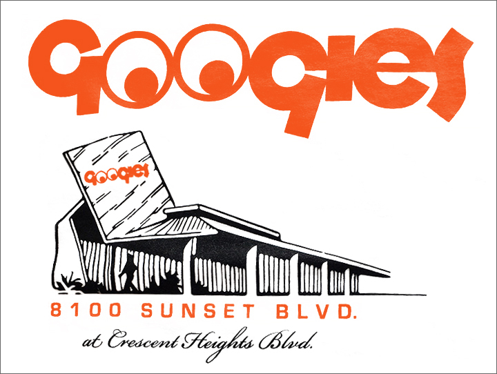
The 'Gs' seem to be cracking a sly smile. The 'Os,' like owl-rim eyeglasses, frame a pair of eyeballs. The remaining letters in the word—'Googies'—do a little dance.
Throughout the ages—from the time Sumerians carved messages into clay, through scribes, Johannes Gutenberg's movable type, and the rise of 'monster fonts' in the 19th century for street advertising—letters themselves have communicated just as vividly as the messages they were intended to convey.
Letters do more than convey meaning. They express feelings. And they can catch you unaware.
"For most people, type is more of a subconscious or unconscious thing," says Kate Widdows, a Portland designer who focuses on letters, neon signage, and more. "People read the type and pick up the mood that comes with it."
"An individual letter is called a 'character.' They are almost like people, in a way," she says. "The terminology used for letterforms is 'head,' 'foot,' 'shoulder.'" With many typefaces, she says, "You can see the motion, the energy in each letter."
Type is very much of its time. As anyone who has admired home facades in a modern tract by builder Joe Eichler knows, there are house numbers that work and house numbers that do not.
The typefaces that define the 1950s and 1960s tell us it was a time of change, when new forms of transport, commerce, media, ways of advertising required different forms of lettering.
The varied places type was used—on the sides of department stores, Googie-style coffee shops and tiki-themed apartment buildings, in the opening credits of 'The Twilight Zone,' in freestanding neon signage, on the fenders of fin-tailed baby-blue Cadillacs—demanded new faces and new ways of using them.
The 1960s witnessed a "revolution of clean, modernist typography," Stephen Coles wrote in his article, 'Mid century typeface: a reflection of Modern architecture.'
"The short, bold, sans-serif statement was a stark reaction to the hand-rendered script lettering and long-winded copy that cluttered print advertising of previous decades," he continued.
'Sans serif,' which means a letter without tail-like or ear-like projections at its ends, is the sort of simple typeface most people associate with modern design. Eichler house numbers, for example, are sans serif, and so are the house numbers hip, young moderns toss onto their mid-century modern homes these days.
Sans serif types were designed generally to be "less humanist" than earlier typefaces, says Shelley Gruendler, a Northern California typographer who travels the world teaching the art through Type Camp, in that they don't suggest a human being behind them. "These letterforms would have nothing to do with the pen. They do not reflect the hand of the creator," she says.
But sans serif type can communicate mood as well as more elaborate faces. "Some people like to make distinction between serif and sans, the coldness and utilitarian—traditional versus colder, more utilitarian type," Widdows says. "But 'sans' can be expressive, definitely. That is why there are so many typefaces. They all carry a different mood."